Saturday, July 08, 2006

IntelliGantt. I like that.

I liked it so much, I created a blog using that as the name.

And, I found the domain name was available too!

Kismet.

The Blog Has Move Here.

Friday, July 07, 2006

It's Intelligent. It's a Gantt Chart. It's Intelligantt!

The Gantt Chart has become the standard bearer of project and task information. It has also become a magnet for scorn and ill-will, becoming the embodiment of all that is wrong with Project Management software. People recognize Project Management software not by the familiar grid listing tasks, though that might not be winning many friends either, but by the distinctive two dimension task/time chart.

I'm here to tell you the Gantt Chart is getting a bad rap. We saw a few things we could improve and came up with this:
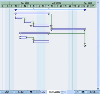


A few things this shot shows us is an improved palette and color scheme; nice distinctions for projects, summary tasks and tasks; current selection indicators on both the date line (subtlely highlighted dates and two small arrows) and draggable link chains on either end of the selected task; a clear directional arrow and the endpoint of each link; and a milestone that looks like a present waiting to be opened.

Definitely improved, possibly pretty, but there's more. There are VCR buttons at the bottom for easier scrolling, and a date box that takes you when you want to go. Just outside of the VCR buttons are Start, Today and Finish. These buttons take you to the Start of the project, Today's date and the Finish of the project. You could say we paid a little more attention to time travel in this product!

Now for a few 'hidden' features, in the sense that they're not immediately apparent, but they are immensely helpful. In keeping with the time theme, the first one helps you oriented on tasks with respect to the current viewing date. Here's a picture:
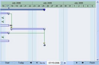


What happened? The view window moved into the future 9 days, from July 7 to July 16. What was the result of that move? Well, the tasks all moved to the left, appropriately, but some tasks moved so far that they're no longer visible for this view. We could simply forget about them, but we thought it would be helpful to give you an arrow showing where that task is on the timeline-- either in the past like these three, or in the furture. And yes, you can click on that arrow and it will snap into view.

Another feature designed to help you out deals with scheduling and task linking rules. I don't know about you, but I can't keep a very good mental image of task link dependencies in my head. If I can't make one task dependent on another, I'd like to know why instead of figuring it out myself. Something like this would be extremely helpful:
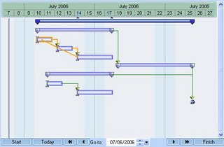


This shows me what the problem is before I get my hopes up that I can make this link. Our philosophy regarding project management in general is its better to warn people beforehand than tell people afterward. This is an example of our philosophy in action. By the way, you didn't have to press a button to get the conflicting path to light up. This gantt chart is interactive-- as you drag the link endpoint over any task, it will either pass or fail a link test. If it fails, it turns orange (as you see); and if it passes, it stays green.

Though there is more, I'd like to wrap up with a wish I've always had: Don't you just want to drag a summary task sometimes? You know, put this block of tasks starting here. Me too. In fact, sometimes I'd like to drag the whole project backwards or forwards if for no other reason than to show our customers how flexible we can be with scheduling.

And that's what I do with TeamDirection Project. I can drag summary tasks and projects forward and backwards. It makes for very nice scheduling flexibility and works very well for templates (copy, paste, move).

And when you try it out, wait til you see what happens to dependent successor tasks. It's interactive and way cool!


A Note: We have two versions of our project management tool available. One for SharePoint and one for Groove. The Groove tool requires installation of Groove in order to run, but the SharePoint tool can run standalone. Download the SharePoint one to see the nifty features blogged about today. You can get it HERE

Wednesday, July 05, 2006

Sexy Project Management?

Well, not quite. However, Project Management doesn't have to be drab... or boring... or pedantic... or intimidating... or a myriad of negatives your imagination can fill. While some kind of management may be necessary, if you want people to buy into it, it has to be... usable... and understandable... and intuitive... and productive... and even pleasurable.

I offer Exhibit A:


While it may not be so pretty as the face that launched a thousand ships, it could certainly build a thousand ships.

Why is look and feel so important? Think about your operating system for a moment. Do you realize how much effort, over the years, has gone into making your operating system:


User Friendly
User Friendly
Ubiquitous
User Friendly
Robust
User Friendly
Secure
And did I mention User Friendly?


The number one key to adoption is making your application, be it on the web or on your hard disk, be it on Windows or on Mac OS, be it 96 dpi or 120 dpi, User Friendly . We believe a computer user wants things well laid out and understandable. And if it happens to entertain them just a little bit along the way, all the better. And that's why there is such a thing as eye candy, which we prefer to call Design.

But in fact it is design, certainly by design, that the operating system has become more friendly over the years even as its grown more powerful. Raise your hand if you still prefer a command line. Have you noticed that 100x the population does not?

This isn't to say Project Management tools are currently at the command line stage, but they are also not at the Windows Vista stage either. Everyone we talk to laments the Project Management experience. All the rules and minutia. The arcane nomeclature. Grids and Gantt charts as appealing as concrete. And of course, who likes deadlines! Face it, intelligible and accomodating Project Management will happen only when... well, when it becomes a priority. And in this day of ever-growing interconnectedness, its a has become a priority.

We've tried to design both the UI experience and the Data experience for the user to provide information, feedback and utilitiy. Which leads us to our upcoming series of posts. Our Design Decisions.

How To Sell A Good Product

So you want to start a company?

Yes.

So you know what you want to build?

Yes.

So you know your target market?

Yeah, pretty much.

So you know how to talk to them?

Um, English?

Fine, give me the pitch.

We build this really cool Project Management 'smart client' that utilizes Windows Sharepoint Web Services to help keep everyone on the same page! It's written in .Net 1.1 and has a host of features. And soon, we will be hooking to Groove 2007, as well as SharePoint 2007.

I already have Project.

But this is different.

Buh-Bye.


That's not what you were hoping, was it? Let's say you have a capable development team. And let's say you have a product you believe in. And let's say you even know, in general, the group you want to market to. Has success been reduced to publishing a web-site, sending a few emails and calling a few friends? Hardly. You've just entered the latest phase in becoming a real company. The Marketing Phase.

This blog will explore the trials and tribulations of TeamDirection, Inc. as we start marketing our newest product: TeamDirection Project for SharePoint.

We're not coming out of nowhere. We've been shipping Project for Groove (that's the company Microsoft's new CTO, Ray Ozzie, started) for some time now, and SharePoint is a natural evolution. However, with the Groove product, we could ride the marketing coattails of a prominent industry luminary and significant attractor of media headlines.

Why would anyone be interested in little old us?

Stay tuned as we answer that question in the days ahead.